For quite a few years now, I’ve been theorizing that the practices of User-Centered Design and Usability might eventually supplant Search Engine Optimization (“SEO”). Google has progressively tried to reduce effectiveness of mere technical tricks and tweaks, and they’ve improved their ability to overcome common site infrastructure issues in order to be able to access and rank content.
My theory has been supported to a degree by the announcement that Google was planning to incorporate website speed into the 200+ signals they use in their algorithm to rank webpages.
But, there are even more compelling arguments for focussing higher levels of priority upon refining your website with usability in mind. Highly usable sites make it easy for consumers to find what they’re seeking rapidly, and don’t frustrate their audiences. Usability impacts performance over the long-term, and that has a direct effect on market share and future growth. Google itself prospers on this philosophy, and other sites like Craigslist are similarly successful because they are simple and usable.
For these reasons, one of the standard services that KeyRelevance provides is a careful and comprehensive Usability Review. Optimization of a site in order to streamline user interactions will help to make all other site promotional activites such as SEO and PPC advertising more successful.

This is extremely similar to an analytic tool I created quite a few years ago which “sniffed” my website visitors window sizes when they visited the homepage, stored the values, and then provided percentages of size ranges. Such tools are invaluable when writing the specifications for site designs/redesigns.
The reason this is so important is that one should not create a website design that is so large that key elements are pushed outside of the viewing area horizontally. The vertical area is important as well, but it’s considered of far greater importance to be careful with width, because it’s expected that very few consumers want to scroll horizontally, so content falling off the right side of their screens simply gets missed.
The area of a webpage which visitors can see initially upon arriving, without any scrolling, is called “above the fold”, using old newspaper terminology. Many studies have supported the premise that content “above the fold” on a website typically will receive the most attention and perform the best.
Many designers are using much larger monitor sizes than their site visitors may have, often resulting in designs which do not fit the audiences they’re targeted-to. The egos of corporate employees often figures in as well, and there’s a human tendency to be impressed with larger, graphically-intense splash pages with too much key content falling outside the horizontal width or below the fold for many users.
Magazine sites frequently neglect to design towards internet users, perhaps because their designers may often be more accustomed to print media design where there are far fewer variables in designing a common user experience for the audience. For example, Vogue’s website when viewed with Google Browser Size shows that a significant percentage of the audience will not see content on the right side of their homepage, including the important badge ads that are intended to generate revenue:
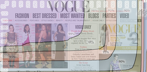
You can see that their masthead navigation links for “International” and “Video” are falling into the band of “90%” in Browser Size along with the site search form – this means that 90% of internet viewers are viewing pages with their browser windows large enough to see that right side content. The other 10% are not able to see this content, and might miss that it’s available. I’d bet that if we looked at Vogue.com’s analytics we’d find that those links get significantly lower click-throughs compared with more-commonly-visible areas on the page.
When we look into the 95% band, we see header links for “Renew”, “Parties”, and “Style.com” get lopped out of the viewing area, along with the ad content.
Vogue’s site is designed to be about 980 pixels wide – at the upper end of the typical range of non-dynamic width websites. When you see how the larger size results in a less-optimal experience for 5% and 10% of their overall audience, one can’t help but ask if the designers could have created a design at a smaller width while still retaining all the beneficial aesthetic value. I’d say that they most definitely could have, but they likely were ignoring the statistics when they set the site design specifications.
The wider design represents a lot of untapped opportunity, and money left on the table. While 10% may not seem like a large percentage, when you figure how many visitors Vogue’s website must receive annually, the raw numbers of people that fit into that demographic really add up. That 10% of people whose monitor screens were likely too small to easily see that right-side content on Vogue resulted in fewer people clicking through to view the Video content, International content, and the search form. The 5% of visitors would have missed the “Renew” link and the ad content, resulting in a little less revenue.
If you’d like to see a site that’s done a far better job of setting their size with user browser window limitations in mind, check out Nordstrom. Their site fits in a width closer to 770 pixels, making it work for a much greater percentage of internet users.
There are some caveats to using Google’s Browser Size utility. For one, the striations of browser size percentages that they display in that tool are based upon Google’s usage statistics, and not your site’s. While Google certainly has a huge usership sample to base these numbers upon, your site may have a significantly different demographic of users who have larger or smaller monitor sizes and browser window widths.
Google’s Browser Size utility is a fast way to check size based on overall internet averages, but if you want to do even more precise checking of your audience’s capabilities you need to check your analytics to see how many users are accessing your content with what size of windows and/or monitors. Here at KeyRelevance we do calculations based off of your analytics package for this — a lot of top web analytics (such as Google Analytics) will give you detailed numbers over time.
Regardless of which method you use, you need to take browser window size into account when redesigning your site. This is an easy way to bake more success into your website without trying to do anything complex or tricky.


I have just started internet marketing and being a newbie, it’s really tough to earn good amount. I have never read any ebooks, though. We need a lot of money to invest for marketing.