Finding Lost Souls
Customized 404 Error Pages Is Good Marketing
by Christine Churchill
Imagine the following scenario: you have just spent an arm and a leg on a new and vastly improved web site. It’s launch day. Everyone’s nervous and your boss is breathing down your neck, saying “This site had better earn its keep!” You’re confident it’s a winner. Professional copywriters have inked out content fit for an award; your design is striking, yet user friendly. You’ve checked your links, validated your code, and tested the site from every angle. You’re ready to go live. Or are you????
There’s one item on the pre-launch checklist that is routinely done wrong that can seriously hurt business. I’m talking about the Error page for the web site.
Fast way to scare a customer to a competitor
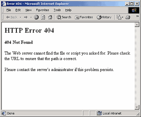
In the rush to get the new site launched, many sites fail to take the time to create a user-friendly customized error page. Potential customers who mistype a file name or click on a link to a page no longer on the web site are served up one of the scariest pages on the Web, the cold, generic, dreaded default “Page Not Found 404 Error” message! No friendly language, no helpful guidance, just personality-less geek speak to drive the visitor straight to the competition.
We’ve all seen the page; it looks something like this:
|
Falling through the crack and taking revenue with it
Sadly, the scenario I described happens every day. Custom error pages are trivialized and brushed off as someone else’s responsibility. Considered a “techie problem” by many marketing departments and “unimportant” by most IT departments, this page often falls through the cracks. If the only the CFO realized how much potential income was lost by this experience, it’s likely the lowly custom 404 page would receive a whole lot more attention.
What are error pages?
If you mistype a file name, the server serves up what is called a “404 response.” Since most visitors have no idea what a “404 error” is, the average user interprets this page as a definitive dead end. “No longer in business?” “Bought out by the big guys?” “Mismanaged IT department?” Most people’s immediate reaction is to assume the site is broken and hit the back button to go to another site – usually your competitor’s. A visitor having a generic 404 experience on your site is a lost revenue opportunity. At the very best a bad 404 experience annoys the visitor, at the worst it makes a visitor never come back to your site.
It doesn’t have to be this way.
When life gives you lemons, make lemonade…or Key Lime Pie!
A good custom error page takes the bad experience and turns it into a good one. It helps your customer know it’s not their fault they got lost. It takes them to a useful navigation site where they can quickly find what they need. It’s helpful. Comforting. It’s smart marketing.
Think about your experience when you get lost in a multi-storied department store. When you can’t make your way to the Home Goods Department, let alone find a clerk that can help you out, how do you feel? When you’re lost, frustrated, losing time, how do you feel about the store/its manager/its merchandise? A nasty generic 404 page gives the same experience.
Now imagine you’re lost in Home Goods, searching for Beach Gear. Before you have a chance to look for the nearest escalator and store map, a cheery clerk comes up to you and says, “You look lost. Can I help you?” Relief floods in. You bound down the staircase straight to Vacation Island, pick out a bright pink pail and blue shovel and sail off, happy ev…. Ok, you got the point. That, in a nutshell, is the purpose of the custom error page.
Error page checklist
This list of essential elements for your custom error page will dramatically change your visitor’s experience. Simple, effective, and thoughtful, these guidelines will impart a sense of stability, professionalism, and customer service that can reverse the negatives of broken or dead links.
- Retain the overall site look and feel to make the visitor feel comfortable. This is important because you want visitors to know that they are still on your site and that your site is a stable entity. In spite of some popular belief, it is good to use your normal branding and regular site template on your error page.
- Use friendly, non-technical language to explain that the page they are looking for is not available. Avoid any scary language about “404 errors” unless the site is technical in nature. Most visitors immediately glaze over when you start mentioning server codes. Don’t waste time or space telling them about what a 404 error is. They don’t care. They just want the page.
- Be informative without being insulting. It’s okay–but not essential–to include a simple explanation that the file they requested may not exist due to a bad link or mistype, but don’t insult the visitors or assume it’s their fault. It’s not just bad etiquette (which in and of itself would be enough)–many an arrogant webmaster has had to eat crow after discovering the 404 cause was a bad link… from his own site.
I shouldn’t have to say this, but after looking at some examples of 404 pages I really do have to spell it out. Don’t insult the visitor by telling them to “learn to type” or calling them “suckers,” “stupid,” or imply they can’t find their way out of a brown paper bag. Common sense and good manners are still good business practices. Try to remember error pages are an extension of your site, your brand, and company image.
- Help the lost visitor to get back on track quickly. Provide useful information to help the user get re-oriented. Link to your most popular pages or to your site map. You want the user to keep traveling on your site, so help them find what they want. Don’t give them an excuse to go elsewhere. In general, don’t send the visitor back to the HOME page. They came to your site for a purpose and will generally want something more detailed. (See more on this below.)
- Provide a search option on the custom page. This not only helps the visitor find the page they are specifically looking for, but when you capture that data, it provides a wealth of information about what visitors are looking for. So mine that information, and use it to your advantage.
- Include a short contact form on the 404 page so users can it fill out and give feedback. If they do write in, be sure to respond quickly. You want to reward and encourage customer feedback.
- Include an email link so visitors can notify the webmaster of a problem. Remember: don’t assume the visitors are wrong. You can’t pay for this kind of Q/A Testing. Many site problems have been discovered and reported by conscientious visitors.
- Design the page to load fast. You can include graphics on the 404 page, but be sure to keep the graphics lean and use a graphics optimizer so the pictures load quickly. There’s a free graphics optimizer on the NetMechanic site. (http://www.netmechanic.com/accelerate.htm)
- Make the file size larger than 512 bytes. There have been reported problems with error pages not displaying properly if the size is smaller than this.
- Monitor your logs for error pages. This is one of those best practices that is often overlooked because it’s not “sexy.” However, checking your error log or 404 page list in your Log File report is a good way to identify bad links from an external site and problems within your own site. If your logs consistently show that you are getting a 404 error for a specific page request, create a page to send people to the right page. Look at the referrer info to track down and repair the broken links whenever possible.
- Think of the error page as a marketing opportunity. Surprisingly, the 404 page is often one of the most frequently visited pages on a site. Have it be your goal that this page is not a “single access page” but is helpful enough to steer the visitor to a useful page on the site. Done right, the 404 page will promote your company to visitors – not scare them away.
- Humor can be effective. Depending on the nature of your site, humor on an error page can be an effective way to keep the visitor on the site and in a good mood. A site that does that effectively is The Motley Fool. Check out their error page here: http://www.fool.com/kkk
Just be careful with humor. Insulting the user is not funny. It shows bad taste and a lack of respect to the visitor. It also shows a lack of business savvy. Do you really think someone who has just been insulted would want to do business with you?
Redirecting to the home page is not the best solution
Many companies set up their server to redirect to the home page when a visitor mistypes in a file name. Depending on the home page this may be adequate, and short of that, it’s still usually not the best solution for the visitor.
Put yourself in the user’s position: you typed in a file name or clicked on a link expecting to see a specific page. Suddenly, you’re whisked off to the home page. That can confuse you and make you wonder what happened. Are your other searches going to be misdirected? Is this bait and switch? Don’t give the visitor any reason to feel uncomfortable while on your site. They’ll associate that experience with your service or product, unconsciously and unnecessarily.
Redirecting the user to the home page doesn’t acknowledge there is an error, which if done effectively gives confidence to the visitor that your company can handle things when they don’t run like clockwork. Finally, most home pages are too broad to be helpful to the user to get them back on track. The home page redirect solution is considered the lazy webmaster’s solution – it’s better than the scary message page, but not customer oriented.
There are some internal problems with HOME page redirects as well.
Most servers will process a HOME page redirect and without capturing the information that an error has occurred. Since the page serves up a 200 response (Page Found – Page Okay Response), the IT department assumes everything is running fine. There may be glaring errors on the site that are covered up because no error logging is occurring.
Serving up the home page as your 404 page could also potentially run afoul of the search engine’s duplicate content detectors. Check out my friend Ian McAnerian’s blog discussion on this at http://www.mcanerin.com/articles/301-redirect-404-error.htm.
Good custom error pages = happy customers
The web is getting more competitive as more companies enter the online marketplace. You need every edge you can get. In the rush to launch the coolest web site, don’t forget basic marketing good practices. A little thing, like how you help lost customers, is fundamental to good customer relationship building. It’s the little things they remember, like chocolate mints on the bed pillow, that sweeten the user experience.
Now that you’re inspired and convinced you need to create custom 404 pages, here are a few resources to help you on your way:
404 Error Page Resources
http://www.404lab.com/404/ – The folks from plinko.net have put together a great site dedicated to 404 pages. The site includes a list of helpful technical references and a fun area called “Area 404” that provides links to creative 404 pages.
http://httpd.apache.org/docs/1.3/custom-error.html – Information on setting up a custom error response on Apache.
http://www.cre8pc.com/blog/2004/11/user-friendly-error-and-feedback-pages.html – Usability guru Kim Krause Berg discusses usability and good business reasons to create a custom 404 page. As always, Kim is spot on with good common sense advice.
http://msdn.microsoft.com/library/default.asp?url=/library/en-us/dnasdj00/html/asp0084.asp
Here’s a reference resident-genius Randy and moderator from High Rankings Forum pointed out in this thread on Custom 404 pages. (http://www.highrankings.com/forum/index.php?showtopic=17293&hl=custom%20404&st=15)


