In the realm of missed marketing opportunities, I think marketing after the sale is one that is missed most often. Many e-commerce sites consider the sale the end of the relationship. In fact, this is really just the beginning of the conversation. I read an excellent article over at GetElastic.com that Continue reading
Category Archives: Online Marketing
Online Strategies to Survive a Man-Made or Natural Disaster

My online marketing background started in the travel industry. Now at KeyRelevance I deal with clients with a wide range of interests. The one thread that is constant is the reality of what a crisis or disaster can do to your online and offline business. Hurricanes, Oil Spills, Fires, and other disasters happen all the time. Sometimes we have a business that can thrive in these environs, sometimes Continue reading
Getting Query Data from Google Webmaster Tools to Correlate with SEO Query Data in Google Analytics
As most marketers are painfully aware, In Oct 2011 Google stopped providing keyword referral data in Google Analytics for searchers who are logged into Google or for searchers using Secure Search (which Firefox has more recently adopted as the default for Google searches).
As a result of the loss of this valuable keyword data source, online marketers have become very creative about designing ways to recapture some details on the search behavior of these visitors. One approach has been to extract more information out of the Google Webmaster Tools (GWT) data which so far isn’t affected by the not provided restriction.
The query data in GWT is limited. The reports provide impressions and click information, but no conversion or other site engagement data. As a result, the data is good for keyword research and to find terms that are relevant to your site, but you’ll likely still have to test the terms in PPC to gain actual conversion information about the terms.
If you have your Google Analytics and your Google Webmaster tools accounts linked you can view the GWT query information directly within Analytics. Google has a section called Search Engine Optimization that displays data sourced directly from GWT.
Not a Discrepancy, a filtering Inconsistency
If you have looked at the SEO data in Analytics and then logged into your GWT, you probably noticed that the queries don’t correlate well. The reason for the list of queries being different is due to the default filtering being different in the two reports.
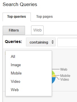
In Google Webmaster Tools, the queries are filtered to show search query impression and click data from Web searches only by default. You can see a snapshot of the query filtering options below. Notice the Filters button and to the right of it the default is Web.
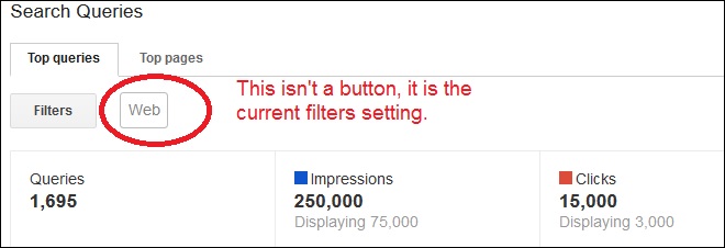
If you click on Filters you can chose between Web, Mobile, Images, Video, or All. In GWT they list queries filtered for Web by default.
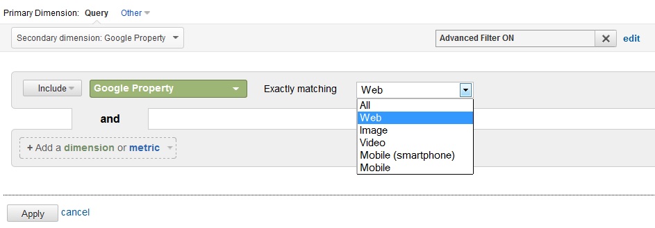
If you then go over to Google Analytics, you will notice that the SEO queries are not filtered. You essentially get the All option. If you want to compare the default list in GWT, you will need to tell Analytics to include “Google Property” and filter for Web.
Then assuming you have the same date range in both Google WT and GA and that you have the data sorted by the same metric, the lists should correlate. Please note that there may be latency reasons for the data not matching if you select a too recent date.
Once I realized the filtering was different the query data made a lot more sense. Hope this helps a few who like myself, was puzzled over the lack of consistency in the query data.
Issues with Google Adwords Editor 10.0.0 and Enhanced Campaigns
Summary: Be aware that Google Adwords Editor 10.0.0 can mishandle SiteLink and other enhanced campaign information when moving from the desktop to your live account and vice versa.
Google has announced a significant change to Google Adwords in their new Enhanced Campaigns. Since migrating from standard campaigns to Enhanced Campaigns involves merging previously separated desktop and mobile campaigns, a lot of the pain can be mitigated by using the Google AdWords Editor (GAE) to move ads/keywords from one campaign to another.
Support for Enhanced Campaigns within Google AdWords Editor had to wait until Version 10.0 was released. The good news is that Version 10.0 was released on 28 Febuary 2013. The bad news is that it suffers from some growing pains. Here are two of the issues we have identified so far:
Moving Enhanced Campaigns started on the web interface
If you have already started the migration process through the web interface, and have taken advantage of the new SiteLinks at the AdGroup level feature, be aware that these AdGroup level SiteLinks may not import into Google AdWords Editor 10.0 correctly. In our tests, these SiteLinks were lost from the adgroup on import. Campaign level SiteLinks were also lost.
Posting SiteLinks are uploaded to the server, but not attached properly
When you post your SiteLinks in an enhanced campaign, they DO appear to get copied up to your account on the server, but with an issue: the SiteLinks are listed as a shared resource for the account but are NOT consistently being attached to the campaign/adgroup to which they were initially added.
What’s probably going on
I suspect that Google made a change as to how SiteLinks are handled internally. In standard campaigns, the SiteLinks are attached to each campaign. With an Enhanced Campaign, the SiteLinks are being treated as an account-level shared resource (like Remarketing Audiences), and the shared resource has to be attached to the appropriate campaign/adgroup. The transition process for this change of implementation is not being handled completely properly.
Conclusion
As with many software tools, using version 1.0 is often a little chancy. The 10.0.0 release is version 1.0 for Enhanced Campaigns. The good news is that Google is pretty responsive to these sorts of issues, and hopefully an update will be forthcoming.
Defensive tactics
In the interim, take it slow. Migrate one campaign at a time, and double check that this various components are being properly applied. Also, keep an eye out for version 10.0.1.
Evaluating Marketing Opportunties as a Small Business Owner
Small business owners struggle with marketing. It’s a fact. Spending the time to create a strategy is just the first step. Execution, consistently and deliberately, is a completely different matter. Beyond execution, measurement and agility to implement change is even the next step. When running your own business alone, this becomes even more difficult – factor in the time spent on customer service, inventory, staffing, banking, billing, etc – and marketing is the piece that gets pushed to the bottom of the list.

With more and more importance placed on “being” in the market, finding and making time for marketing is even more important. Knowing how and Continue reading
Are You Ready? Are You Sure?
I recently ran across a promotion from McDonalds that lined up with the Olympics. I was in the store, eating with my family on vacation, and had to visit a website to enter a code to be eligible to win. The only device I had available at the time was my smartphone. I  imagine just about every single entry for this contest comes from a mobile phone due to the way the contest was set up and the game pieces were distributed. Here’s the issue, I had to fill out a form that was about 15 REQUIRED items long, and every time you clicked on a box to fill it in, the entire page scrolled to the bottom.
SO FRUSTRATING
Once I finally got the form filled out, I thought I had submitted my registration correctly, but when I entered the codes for the game, I was given an error Continue reading
What’s in Your Toolbox?
Every marketer who handles multiple aspects of online presence will tell you, we change gears so much, and have fingers in so many buckets, that having tools to help us monitor and keep track of campaigns is essential. That being said, there are a ton of tools out there to choose from, and everyone has an opinion on what the best ones are. I generally talk from experience when it comes to tool selection. I don’t recommend that which I don’t use, and I am pretty picky about usability when it comes to software.

My favorites are the ones that I can figure out without reading a manual. I’m terrible about instructions. I want things to be intuitive and easy to use, so multi-step screens and
Tracking PPC Traffic from Bing and Other Sources in Google Analytics
Using Google Analytics in conjunction with Google AdWords is a useful way to track visitor behavior beyond the click. But what about Bing/Yahoo PPC visitors? By default, Google Analytics tracks all Bing or Yahoo visitors, but does not discriminate between paid and organic visitors. If you want to track PPC visitors coming from Bing, you need to add some additional parameters to the landing page URL for the Google Analytics system to decode and track.
As an added bonus, this same technique can be used to track other advertising efforts (e.g. newsletters, site sponsorships, and banner advertising).
How to Track Bing PPC Visitors in Google Analytics
Tracking other PPC/CPM/Advertising campaigns requires setting a couple of additional Continue reading
Competitor Comparisons – Metrics to Measure

We’ve all been in that situation; you know the one – the keyword that you just can’t seem to get ahead with. That competitor that should not outrank you..is…and its driving you crazy.
It took me quite a long time to realize that chasing competitors can be a waste of time. There’s so much work to do to improve your own website – wasting energy on a competitor that dogs your every step takes time away from actions you can perform to increase your conversions and make their presence a non-issue. Constantly obsessing about a position that flip flops with someone else or where you can’t Continue reading
Vacation Rentals Inflating Reviews In Google Maps
I’ve been noticing an oddity in Google Maps for vacation rentals: some listings have got simply unbelievable numbers of reviews.
Now, I see a wide range of numbers of reviews for all sorts of industries — from zero or just a small handful, to around a hundred, all the way up to a few thousand for highly-popular eateries located in big cities. So, a range of these numbers is normal, and for some cases it’s normal for there to be a few thousand.
For instance, the famous Union Oyster House in Boston is showing a couple of thousand reviews. Considering it’s the oldest restaurant (in continuous service) in the entire country, this even makes sense. It makes even more sense when you see that they have quite a few hundred reviews in Yelp, and OpenTable as well. When someone has placed a reservation for the restaurant in OpenTable, they may be receiving an invite to rate the restaurant after they’ve had their visit there. I’d say this is is a great practice and works well for everyone — the business itself, the person rating, OpenTable, and for consumers shopping for an eatery. The natural outcome is that they’ll have hundreds and thousand of reviews in a relatively short time period.
But, there’s something else going on in vacation rentals which is similar, but isn’t ideal. Continue reading