Usability Testing in the Real World

In his humorous 1968 novel, Heaven Help Us, author Herbert Tarr describes how a young rabbi (Rabbi Small) helps a bar mitzvah student give a stellar performance. The student is so nervous that even the sound of someone sneezing is enough to break his concentration.

Rabbi Small’s solution is to so inure the boy to noise and distraction that he can continue the service unflustered – no matter what’s happening around him:

“I rambled around the sanctuary, sneezing, coughing, rattling candy wrappers, stamping my feet as Sandy spoke. I also broke paper bags, sneaked up on the boy and yelled in his ear, though it embarrassed me to be caught throwing Silly Putty at a bar mitzvah boy while he spoke earnestly about God.”

I recall this scene whenever I conduct usability tests. Rabbi Small tried hard to create real-world conditions for the boy. It’s a good idea. You’ll get better data from your usability testers if you provide some common distractions during the test.

Think about it: how often at home or in the office do you have the luxury of peace and quiet while you work? The office environment is filled with water cooler chatter, ringing phones, and that annoying co-worker who blares polka music on her CD player. Home isn’t much better – particularly if you have pets or children. Just try to be productive with a child hanging on your leg or a cat reclining on your keyboard.

That’s the real world, and it’s something rarely reflected in a formal usability test.

It’s like those EPA fuel economy tests where nobody ever speeds, gets stuck idling in traffic, or floors the accelerator with an enthusiasm usually reserved for NASCAR drivers. Your mileage may vary because you don’t always drive as if there’s a DMV inspector in the passenger seat.

In a standard usability test though, the user knows she’s being watched. Nobody wants to look stupid in front of the observer, so the tester is motivated to concentrate on the task, go slowly, and pay attention to details.

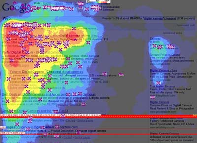
That’s almost completely opposite of how most people actually use Web sites. As Steve Krug points out in his excellent usability manual, Don’t Make Me Think, a misconception we have about users is that: “we picture a more rational, attentive user when we’re designing pages.” Furthermore, we optimistically assume that: “users will scan the page, consider all of the available options, and choose the best one.”

After all, that’s what our eager-to-please usability testers do, right? But be honest. Is that how you use a Web site when you’re alone? No normal person has that kind of time.

I’m not suggesting that you should yell at your test subjects or throw Silly Putty at them. But a bit of background noise and a distraction or two does give the test a more realistic ambience. Arrange for your phone to ring; ask a co-worker to interrupt with a question; drop your clipboard. Or try this: cats don’t care that they’re opaque; have one stand in front of the screen at least once during the test.

Nobody uses the Web in a perfect environment, so try not to be so obsessive about creating one when you do usability tests. A more realistic testing environment will help you get better results. And those will help you design a better, more seamless user experience.

Google AdWords — Raise My Bid to WHAT? And Then!

by Jim Gilbert

Remember to check the and then part…

On the morning of February 16th (Friday) many adwords advertisers woke up to find a shocker with their Google AdWords accounts.

Improve your Quality Score or Raise your bid to $1.00, $5.00 or $10.00!

Weve seen this before, but not on so many legitimate sites and quality landing pages all at one time before. Google has assured us that this appears to be a technical glitch and one they are working hard to resolve. “Good grief we hope this is an issue”.

However, even after this is fixed, we still expect some fallout even on the most legitimate of sites — the quality knob may have gotten turned just a bit too high!

AND THEN….
By the end of the day we noticed some very interesting changes in AdWords… Look at the graphic below: Pause / Unpause Keywords (long time in coming, but well worth waiting for AND Add a “Quality Score” column (too bad it’s just great, ok and poor — if you are being asked to bid $10 YOU KNOW IT’S POOR)

Other sites also reported to original issue… SEO Roundtable, Webmasterworld and DigitalPoint.

Google Checkout Icons – An Unfair Advantage?

By Jeff Martin

I remember in the 90s when web directories and web rings played a vital role in moving traffic along the web. Web directories often gave you enhancing options to your text listing such as bolding your title, changing your text color and placing my all-time favorite – Hot Icon! the flaming HOT icon next to your listing Hot Icon!. Anything that set your listing apart from the others could really pay off. Google is allowing for this type of distinction by allowing Google Adwords advertisers who offer Google Checkout on their site a colorful icon that displays at the bottom of their ads in the Google search results pages:

Google SERP Screenshot with Google Checkout Icon

The Google Checkout icons may significantly help draw attention to Adwords ads that have the icon while at the same time become a problem for other ads. It could be argued that the icons offer an unfair advantage to ads with icons as:

  • The icon takes up a line of text so that the more ads with icons there are on the right the less ad space there is for other ads. It’s possible that an ad that would normally show just above the fold on the right side may not show up without scrolling depending on the number of these icons.
  • They may have a better chance of drawing the eye of users and the click away from advertisers paying more and/or with better quality scores.

This is especially true in Google search results page real estate where it’s cheaper to place ads on the right and more towards the bottom of the fold of the page as these ads get less attention typically. Ads in this area with the icons may have more success now. The image below from an eye tracking study by Enquiro illustrates this as the “hotter” the color the more visual attention the real estate receives (the thick red bar towards the bottom represents the typical fold of the page):

Google SERP Eye Tracking

As more data is collected we should know more about the ramifications of the Google Checkout icon for those who have it as well as for those who don’t.

Could A Caveman Use Your Web Site?

By Larisa Thomason

My family loves the new GEICO Car Insurance commercials where the hapless caveman defends his species against ignorant assumptions that all cavemen are idiots. Apparently, we aren’t alone. News and commentary about the commercials is all over the Web:

This is great viral marketing, and we’re all envious. But the point of the campaign is something that every Web designer and Web site owner should engrave on their keyboards:

“So easy a caveman can do it!”

Yep. GEICO is making usability their value proposition – at least in this ad campaign. If only every other Web site made the same commitment to ease of use.

Unfortunately, if you start discussing “usability” and “accessibility” with many site owners and designers, their response is less than animated. You can generally count on silence, glassy-eyed stares, and gentle snores of boredom.

Actually, usability is anything but boring. It’s a vital ingredient in customer satisfaction. Review these three scenarios. Chances are, you’ve had similar experiences.

  • You’ve spent hours scouring the Web, and finally found the perfect gift for your hard-to-please significant other. Then you can’t complete the transaction because the shopping cart isn’t compatible with your browser.

    Are you bored?

  • Or what if you’ve forgotten to mail your credit card payment and it’s due right now? You go to the card Web site to pay online, but can’t read the information because the text displays in 8px type.

    Have you accomplished your task?

  • How about this situation? You subscribe to a satellite TV service and get a notice that prices are rising. So you sign into your account to see what service you have now and compare costs. But the Web site doesn’t give you access to that information. All you can do is pay your bill and order movies.
  • Does this site offer what you need?

These situations are a minor irritation for most users, but can be major obstacles to users with physical or cognitive disabilities. People using assistive technologies generally have one way to access information. If the site doesn’t accept that method, the disabled user is just out of luck.

Maybe you think: “Hey, that’s just a few people and I can blow them off.

But think back to those users who were irritated or frustrated. They have options, and one of them is to click straight over to your competitor’s site and breeze through his shopping cart to buy that special gift.

GEICO has the right idea. “Easy to use” isn’t just goal; it’s a requirement for a successful Web site. Good usability by itself can’t make your site a success. However, poor usability – by itself – can make your site a failure.

There are many Web usability resources that cover everything from basic usability and accessibility principles to legal requirements for site owners. Check them out:

Then invite that caveman over and ask him to do a usability test.

PPC/SE Market Share… Who Cares! Let’s Talk Conversions! Google, Yahoo, MSN

by Jim Gilbert

Okay, we’ve all seen numbers published on search engine market share for the big three in numerous ways including PPC market share. Number of searches, search engine revenue, PPC revenue blah.. blah.. blah..

But Wait… What do REAL WORLD Conversions Look Like from an advertiser’s point of view?

This test began when MSN’s AdCenter came about and is as about an accurate comparison I am capable of making (which by the way is very fair and quite accurate). Granted, the exact campaigns cannot be built in all 3 PPC engines, but these campaigns are real and built as closely alike as they can be.

And yes EVERYTHING (well most everthing) has been considered including:

– Conversions in this case are based on online sales of a simple product that sells many, many times per day! (so don’t try the “small sample size” excuse on me here).
– No budget limitations.
– Etc… etc… etc…

No more words… the results

Percent Of Actual Conversions
Google 76%
Yahoo 19%
MSN 5%