New Year’s SEO Resolution: Update Your Copyright Statement Dates

In the last few days, I’ve reviewed a few different large websites which have utterly neglected to update their copyright statement dates to reflect the current year.

Copyright statement dates have been something I increasingly check on websites that I audit for search engine optimization purposes, because of a few different things.

Copyright as an SEO Ranking Factor

First of all, it’s now established that Google has been giving special treatment to content dates found on webpages. I’ve written before on the subject of whether dates on pages might be used as a search engine ranking factor. As I wrote previously, Google’s been parsing date information out of pages already, and they’ve decided to often lump these dates into the snippet found below listings of pages in search results. They’ve stated that their usability testing has established that for many types of content, consumers would like to see the date. I’ve argued that it could be a ranking factor, but whether it is or isn’t is virtually secondary to the positive effect that it likely would have on influencing clickthrough behavior.

One type of date that Google typically does not display in the search snippets are the more commonly-used date included with the copyright statement found on most corporations’ webpage footers. However, it’s my belief that Google is likely to be paying attention to this page parameter just as much as they focus upon content update dates, although for slightly different reasons. Read on and I’ll elaborate. Continue reading

Exploring Dates On Pages As A Ranking Factor

During the past year, I became a little excited at one of Google’s many enhancements to the presentation of search results, because I suspected it could hint at a possible ranking factor they might’ve introduced. The element in question is a date stamp.

Dates in Google Search Results Page Listing Snippets

You may’ve noticed that in some cases Google will prepend the usual listing snippet text with a date. That change was introduced sometime around late 2008 or early 2009. I noticed the addition of the date with interest, but I became even more interested after I heard Matt Cutts state in a Webmaster Help video that Google considered the date to be helpful to users:

When Google states outright that they consider some element of webpages to be “useful” to searchers, my ears prick up, because Google is so obsessed with Usability that they sometimes use quantifiable elements of user-centered design in their search algorithms, such as their recent introduction of Page Speed as a ranking factor. In this way, Google’s Usability fixation can reveal ranking factors.

I wasn’t alone in twigging to the dates in search snippets — Continue reading

Google Penalty For Low-Quality Writing?

For a while now, I’ve been covering how Google’s increasing focus upon quality measurements are steadily translating into actual ranking factors. Four years ago, I first conjectured that Usability could supplant SEO. Back then, we could see that Google’s human evaluators added quality ratings into the mix, affecting page rankings. Since then, Google added helpful tools for usability testing and page speed diagnostics. This year they’ve continued this progression by incorporating page speed as a ranking factor and the recent “Mayday Update” apparently shifted some ranking factor weighting from keyword relevancy to quality criteria.

Considering Google’s desire to quantify and assess elements of quality in webpages, what are some other possible things which they might attempt to algorithmically measure and base rankings upon?

Syntactic Sentence Structure - Grammar Analysis

One possible area which occurs to me is in testing the text body of pages, particularly that of the main body of articles and blog posts. Continue reading

Without Usability, You’re Not Doing Advanced SEO

My article covering how Google’s fixation with Usability reveals local search ranking factors published yesterday on Search Engine Land. In it, I described a number of common website elements which few-to-no marketers have ever cited as ranking signals. Some of these elements, such as whether or not a site may have employee profile pages, or whether a site displays prices for products and services offered, might be controversial in search engine marketing circles.

CNNs homepage checked with Google Site Speed

CNN's homepage checked with Google Page Speed - Google introduced Site Speed as a new ranking factor in 2010, and provided tools like this Page Speed extension in FireFox to assist webmasters with Usability improvements.

Other elements I described have been cited by other experts as beneficial for search marketing, even though they may’ve recommended them for reasons other than those I outlined. Inclusion of images, maps and locations pages make sense for multiple reasons in local business websites.

The thought and methodology behind coming up with these factors is sound, and has allowed me to successfully predict present and future search engine optimization factors where others have not. It makes logical sense that while Google is interested in Usability, they will seek ways to quantify and measure it on websites, just as they have done with Site Speed. And some very easy usability elements to quantify include common website elements such as the About Us, Contact Us, and Locations pages.

Back in 2006, I began predicting that the practice of Search Engine Optimization might become replaced by Usability. Unquestionably, this change is occuring to some degree right now.

I’ve known a lot of top corporations which are involved in very sophisticated paid search marketing and search engine optimization, but few of them are also including usability testing and user-centered design considerations when performing a site redesign. Google has tried to make the importance of user-experience abundantly clear by actually going public with their adoption of page load times in determining search result rankings, but many companies are still not connecting the dots.

Here at KeyRelevance, we have long prioritized usability in our assessments of web sites’ design. When companies contract with us to audit their websites, we offer both a Technical Website Review as well as a Usability Review. However, many companies eschew our Usability Reviews or dismiss them as less-important.

For some reason, people often react to usability recommendations from experts in an emotional way, rather like how a portion of the population avoids going to their doctors for a yearly physical. For some companies, there are already so many dependencies and requirements going into web design projects that they can’t include more without losing impetus. For others, individuals with authority over projects have egos which do not want to lose discretionary control over project decisions which could be altered if usability research ran counter to what they desire to do.

Usability testing can be the difference between a design that becomes highly popular versus one which is rapidly forgotten. Google itself is an example of how user-centered design will translate into success. More design options can be scientifically decided, honing down to interfaces which will maximize ease-of-use and enjoyment-of-use. Instead of being avoided, usability testing should be embraced — after all, in the business world we’re looking to increase the potential for success in our company projects, right?

Knowing Google’s heavy focus upon usability factors, consider that if you’re not doing iterative Usability testing and adjustment for User-Experience, you really may not be doing “Advanced SEO”.

If you’d like a thorough Usability Audit of your site, contact Key Relevance today to schedule our review and get a report of items to consider before your next sitewide redesign is completed.

Also, check out some of the free tools that Google has been providing to help you with portions of usability analysis. Try out Google Browser Size, Google Page Speed, and look at the Site Speed reports in Google Webmaster Tools for your website.

Designing User-Interfaces For Best Internet Marketing Performance

For quite a few years now, I’ve been theorizing that the practices of User-Centered Design and Usability might eventually supplant Search Engine Optimization (“SEO”). Google has progressively tried to reduce effectiveness of mere technical tricks and tweaks, and they’ve improved their ability to overcome common site infrastructure issues in order to be able to access and rank content.

My theory has been supported to a degree by the announcement that Google was planning to incorporate website speed into the 200+ signals they use in their algorithm to rank webpages.

But, there are even more compelling arguments for focussing higher levels of priority upon refining your website with usability in mind. Highly usable sites make it easy for consumers to find what they’re seeking rapidly, and don’t frustrate their audiences. Usability impacts performance over the long-term, and that has a direct effect on market share and future growth. Google itself prospers on this philosophy, and other sites like Craigslist are similarly successful because they are simple and usable.

For these reasons, one of the standard services that KeyRelevance provides is a careful and comprehensive Usability Review. Optimization of a site in order to streamline user interactions will help to make all other site promotional activites such as SEO and PPC advertising more successful.

Google Browser SizeGoogle Labs provides a very useful tool for analyzing one of the many aspects of Usability which we commonly look at when reviewing clients’ sites. The Google Browser Size tool allows one to input the URL of a webpage, and they provide a semi-transparent overlay which outlines the area on the page which is visible to certain percentages of users viewing on various sizes of monitor screens and browser window dimensions.

This is extremely similar to an analytic tool I created quite a few years ago which “sniffed” my website visitors window sizes when they visited the homepage, stored the values, and then provided percentages of size ranges. Such tools are invaluable when writing the specifications for site designs/redesigns.

The reason this is so important is that one should not create a website design that is so large that key elements are pushed outside of the viewing area horizontally. The vertical area is important as well, but it’s considered of far greater importance to be careful with width, because it’s expected that very few consumers want to scroll horizontally, so content falling off the right side of their screens simply gets missed.

The area of a webpage which visitors can see initially upon arriving, without any scrolling, is called “above the fold”, using old newspaper terminology. Many studies have supported the premise that content “above the fold” on a website typically will receive the most attention and perform the best.

Many designers are using much larger monitor sizes than their site visitors may have, often resulting in designs which do not fit the audiences they’re targeted-to. The egos of corporate employees often figures in as well, and there’s a human tendency to be impressed with larger, graphically-intense splash pages with too much key content falling outside the horizontal width or below the fold for many users.

Magazine sites frequently neglect to design towards internet users, perhaps because their designers may often be more accustomed to print media design where there are far fewer variables in designing a common user experience for the audience. For example, Vogue’s website when viewed with Google Browser Size shows that a significant percentage of the audience will not see content on the right side of their homepage, including the important badge ads that are intended to generate revenue:

Vogue's Homepage Size vs User Browser Window Sizes

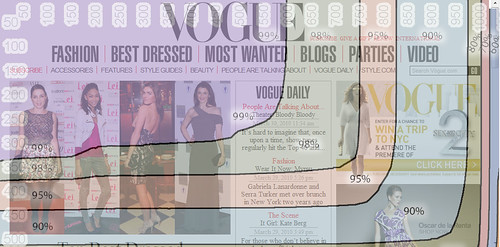
You can see that their masthead navigation links for “International” and “Video” are falling into the band of “90%” in Browser Size along with the site search form – this means that 90% of internet viewers are viewing pages with their browser windows large enough to see that right side content. The other 10% are not able to see this content, and might miss that it’s available. I’d bet that if we looked at Vogue.com’s analytics we’d find that those links get significantly lower click-throughs compared with more-commonly-visible areas on the page.

When we look into the 95% band, we see header links for “Renew”, “Parties”, and “Style.com” get lopped out of the viewing area, along with the ad content.

Vogue’s site is designed to be about 980 pixels wide – at the upper end of the typical range of non-dynamic width websites. When you see how the larger size results in a less-optimal experience for 5% and 10% of their overall audience, one can’t help but ask if the designers could have created a design at a smaller width while still retaining all the beneficial aesthetic value. I’d say that they most definitely could have, but they likely were ignoring the statistics when they set the site design specifications.

The wider design represents a lot of untapped opportunity, and money left on the table. While 10% may not seem like a large percentage, when you figure how many visitors Vogue’s website must receive annually, the raw numbers of people that fit into that demographic really add up. That 10% of people whose monitor screens were likely too small to easily see that right-side content on Vogue resulted in fewer people clicking through to view the Video content, International content, and the search form. The 5% of visitors would have missed the “Renew” link and the ad content, resulting in a little less revenue.

If you’d like to see a site that’s done a far better job of setting their size with user browser window limitations in mind, check out Nordstrom. Their site fits in a width closer to 770 pixels, making it work for a much greater percentage of internet users.

There are some caveats to using Google’s Browser Size utility. For one, the striations of browser size percentages that they display in that tool are based upon Google’s usage statistics, and not your site’s. While Google certainly has a huge usership sample to base these numbers upon, your site may have a significantly different demographic of users who have larger or smaller monitor sizes and browser window widths.

Google’s Browser Size utility is a fast way to check size based on overall internet averages, but if you want to do even more precise checking of your audience’s capabilities you need to check your analytics to see how many users are accessing your content with what size of windows and/or monitors. Here at KeyRelevance we do calculations based off of your analytics package for this — a lot of top web analytics (such as Google Analytics) will give you detailed numbers over time.

Regardless of which method you use, you need to take browser window size into account when redesigning your site. This is an easy way to bake more success into your website without trying to do anything complex or tricky.

Do Page Load Times Affect Your Search Rankings?

How Fast Does Your Page Load?As average internet access speeds have improved, many websites have become pretty lazy about paying attention to how fast their pages load, designing bloated content full of heavy images, multiple Javascript and CSS files, and ads or iframes pulling from dozens of sources. This neglect could affect your search rankings, and here’s why.

First of all, Matt Cutts, head of the webspam team at Google, stated in a recent Q/A video that sites’ load times are currently not a ranking factor.

However, there are three reasons to believe that site load times could affect search rankings in the very near future:

  • Matt’s opinion is that it would be a great idea for a ranking factor! And, he leaves open the possibility that it could be used as a ranking factor in the future. He’s influential within Google and is named on some Google ranking patents, so this is significant. Other significant Googlers also have indicated that this may be a focus area of increasing importance to them. Larry Page apparently stated that he wanted Google to be central to efforts to make the internet speedier, allowing users to get pages as fast as turning pages in hardcopy books.
  • Google recently released Page Speed, an add-on for Firefox browsers which can diagnose a number of elements which impact page load times (such as Javascript and CSS files, image file sizes, etc). (This is also likely Google’s competitive response to Yahoo’s similar tool, YSlow, which even Google recommends as a tool for diagnosing speed issues. Combined with these other reasons, I believe there’s cause to believe it’s not just a competitive checklist item, but part of their strategy to speed up the internet experience.)
  • Last year, Google introduced Page Load Time as a ranking element in Google AdWords ads.
  • Internal research at Google has shown that slower page delivery times will reduce the number of searches users will conduct by 0.2% to 0.6%. While this may appear negligible, it undoubtedly would add up to a lot of lost revenue over time for Google, and it proves their point that slowness has a chilling effect on internet use and traffic.

Based on the above reasons I outlined, I think page load times are very likely to become integrated into Google’s ranking “secret sauce” soon, and that sites which seriously neglect page load time will find themselves at a disadvantage.

Classic Search Engine Optimization (“SEO”) lists of tricks rarely include mention of improving page speeds, but Google has steadily been evolving their ranking methods to reduce the impact of technical code tricks and moving toward more human-centered design factors. In fact, one part of their process already includes having their quality team assess the webpages found in search results for many thousands of sample queries. If one of your site’s sample pages fall into their sample set, the assessor’s rating of the page compared to competitors could result in an average quality score being applied to all the pages on your site.

I’ve believed for some time already that Google applies some automated quality scoring to natural search rankings, similar to how they’ve applied such factors to their paid search ads.

My suspicion is that there will likely be some sort of scale of site loading speeds which might be used to impact rankings in the future. And, I’d also suspect that this factor would be used primarily as a negative ranking factor, as opposed to a positive one. By this I mean that pages from competing sites which have all other stronger relevancy ranking elements essentially equal could drop lower in search results if their load times don’t meet some minimum standard. Load time might negatively impact a ranking, but likely wouldn’t necessarily help it rise above a page which has slightly stronger relevancy/importance factors unless that page had serious slowness itself.

I’d further expect that Google would apply some sort of adjustment to try to assess whether one Googlebot visit ran across just a momentary lag condition, versus a page delivery speed that’s always slow. So, I don’t see any reason to freak out if you have experienced a server or application issue for just a brief period!

Even if Site Load Time were not to become an official member of Google’s list of over 200 ranking factors, load time could still indirectly affect your rankings. Avanish Kaushik at Google has strongly encouraged webmasters to pay attention to Bounce Rate (a factor determined as a percentage of site visitors that only visit one page and/or who only land on a page for a few seconds before hitting the back button).

Google can also easily see if a user immediately backs out of a page they find in the search results, and such a high bounce rate may indicate a poor quality result for a particular query. One prime cause of a user hitting the back key can be if a page is extremly slow at loading. So, if Bounce Rate is a factor affecting rankings, then a page’s load time may impact it, indirectly affecting rankings.

Finally, let’s go to Google’s original point about why this is important in the first place: good User-Experience. Along with faster network speeds, sites need to load rapidly for endusers in order to provide a positive user-experience. Even if this were never used directly or indirectly by Google in rankings, it will still affect how users experience your site, and that can affect your ultimate conversion rates and repeat visits.

But, Page Load Time / Site Load Time will almost certainly be a direct or indirect ranking factor.

So, how to prepare for this important and basic factor amongst all your site’s various optimization strategies? Well, very easily and cheaply, you could get a copy of Google’s Page Speed extension and run it against samples of your site pages to see what speed factors it might recommend for you to improve upon.

Also, note that this browser-based diagnostic tool does not assess a number of factors which can still affect site load times, such as network connection times and conditions which cause sites to buckle under higher loads.

KeyRelevance has long considered site load times to be of prime importance and has included a number of factors affecting page load speeds in web site reviews that we provide for clients. In fact, we even provide clients with improved compression versions of their site images for smaller filesizes. Speed of access has long been important to a site’s overall user-experience, and Google’s increasing focus in this area is now making it of central importance to keyword rankings in search results. So, if you want to be at the top of your SEO game, you need to be paying attention to your site’s page delivery speed Google is!

Optimize Your Search Engine Listing for Improved CTR

Earlier this month when I spoke at SMX Advanced on the topic of “Beyond the Usual Link Building”, one of the suggestions I made in the presentation was about how to improve how your listings appear within the search engine results.

There are a lot of people I’ve met who tend to be hyperfocused on whether their pages rank, and don’t spend as much attention on how those pages’ entries appear within the search results pages.

It seems like common sense that if the entry looks like what a user is seeking, they’d be more likely to click upon it. Therefor, if you were to improve your search engine results page entries, you’d also likely improve your click-through rate increasing your traffic.

Compare these listings on Google for a search for “Seattle indie records shop“:

Seattle Indie Music Shops Listings in SERP

You can see that the star ratings and review on the listing for “Easy Street Records” is slightly more eye-catching if you were a records shop afficianado the stars and the dollar-sign price range and the easy-to-read sample review text give it an advantage over the listing for the record shop below it. A consumer who is rapidly scanning and clicking to find what they want is going to be more likely to click here.

How much more likely is such a listing to gain clicks? According to Vanessa Fox, Yahoo! has reported a 15% click-through-rate (CTR) increase on similar types of listing treatments! Their results were based upon comparing the CTR of typical search result listings with CTR of listings sporting their special treatments developed through SearchMonkey. The customized listings really stand out from the other listings, drawing the eye and clicks, too.

Yet, before these research results were released, I’d already seen how merely fine-tuning the listing text alone could improve both CTR and rankings. Using savvy methods for forming TITLEs and Meta Descriptions on pages, one can improve keyword relevance, ranking, and click-through-rates.

Now that Google has launched their own type of enhanced listing treatment, dubbed “Rich Snippets“, there’s starting to be even more options for optimizing listings in search results. The first special treatment they’ve enabled are the ones for reviews and ratings, and it seems clear that they intend to launch more, particularly ones related to the use of Microformats, such as hCalendar, hCard, and hProduct.

One person at SMX who liked this concept of “optimizing listings” for improved CTR was Matt Cutts, who Tweeted out a mention of it:

Matt CuttsTweet re Rich Snippets

While these tactics likely have no direct effect on search engine keyword rankings, I’ve theorized for some time now that they could have an indirect effect upon rank. Google’s frequently-discussed patent for “Information Retrieval Based On Historical Data” includes within its descriptions of ranking methods (“scoring”) the possibility that pages might be ranked according to how often they’re clicked upon when they appear within particular searches. The patent states:

“…scoring the document includes assigning a higher score to the document when the document is selected more often than other documents in the set of search results over a time period…”

Very loosely interpreted, this means that if your page’s listing is clicked upon at a better rate than other pages appearing for the same keyword search, that click-frequency or CTR could actually affect that page’s future rankings for that keyword.

It’s long been controversial as to whether Google implemented many of the methods outlined in various patents like this one, but you already have a good excuse to fine-tune your listings: regardless of theoretical impact on rankings, it could easily improve your click-through rate, improving your site’s qualified traffic!

Quick Tips on Optimizing Listings:

  • Title should be brief and state what the page is about, and who you are.
  • Meta description should be brief and expand upon what the page is about or how it may be better than others listed for the same keyword search.
  • Currently, mentioning deals/discounts/rebates may improve CTR since the economy has pushed people to be more price-conscious.
  • Implementing Microformats now on your site for appropriate types of content will likely position you to take advantage of future rollouts of “Rich Snippets” treatements in Google results.
  • Building a search application with Yahoo!’s SearchMonkey platform will help you to understand how Google’s developing similar types of listing enhancements.

Good listing engineering is a complex task involving semantic tagging, taxonomic research and development, good copywriting, and SEO knowledge. Don’t make guesses when doing this use a good expert if you don’t have experience with it.

Optimize your snippets and SERP listings, and improve your CTR and Performance!

Making Your Content Portable For Your Audience

At the beginning of the week I wrote a piece for Search Engine Watch entitled, “Do You Know Where Your Audience Is?” Knowing this is a piece of the social media puzzle that can decide whether your strategy is going to be a successful venture or a failure. There are a few other pieces to that puzzle, but generally, knowing where your audience is is foundational to any social media strategy.

moving-menIt affects even how portable you make your content. What I mean by making your content portable is making it easy to share, making it easy for your audience to move it across one social platform to another. If your audience finds your content valuable they are going to want to share it whether its through social bookmarking, social news, email or twittering, people want to share great things they experienced. Content that has value can create buzz and word of mouth without the author really realizing what’s going on. If it’s really valuable to the audience and there’s no way to share it, that content might not take off, however just the opposite can happen. If you believe you are always putting out valuable content and you want it shared and you have too many options to share it, this can be a turn off as well as confusing to your audience.

Lets take for example a blog, there are a few ways a blog can be shared. The blog itself can be found to have a lot of great content, and people who just get to your blog via a twitter link, Stumbleupon or a link through email might not be quite that educated on RSS. So having a dozen or so of ways to subscribe to your blog by RSS can be confusing and a turn off, rather than a turn on to people coming to your blog. If you use Feedburner or other like services to handle your subscriptions, take a look at your audience – what are they using to read your blog and choose those top 3-5 icons to show for RSS subscriptions. While you may think you need every single RSS aggegator listed, your audience is likely telling you differently, listen to them, they understand what’s valuable to them. For the most part, Google Reader has become the giant here, people share blogs and blog posts through the “share” option in Google Reader as well as porting out their list of blogs so their own readers (if they own a blog themselves) can keep up to date on what they view is valuable.

Then there’s blog posts and making them easy to share. Again, just like having too many aggregator icons listed, having too many social bookmarking and social news icons in a drop down or spread across the bottom of your posts can be a real turn off. Look at your analytics, listen to your audience, what are they saying about how they found your content? Is your content the type that would really get traction on Digg? Is your audience even on Digg? You’re audience might be on a very niche site like Boudica, which caters to women and not on Digg. In this case having a sharing option for Boudica or sites like it, just might be the better option. Generally the audiences can cross platforms and if your audiences feels its good enough for Digg, they’ll get it there. The point is make it sharable for where your audience hangs out, not an audience who isn’t interested.

When making your content portable, it’s also important to keep in mind, content doesn’t always equal text. Content that’s valuable to your audience can take the form of pictures, podcasts, videos or even slideshares. Making these types of content easy to share is just as important as making your text content easy to share. Make it easy for your audience to embed things, provide the embed code or the link code and well as the sharing buttons you’ve decided are valuable to your audience. Don’t forget to also provide ways to share through email and social networking sites – if your audience is there.

Don’t stress that you need to have every way to share out there. Yes there are plugins for blogs that can list all the popular sites, and are easy to install, but is your audience on those sites? Are you loosing out on having your content on a site where your audience is because you are focusing on where someone else’s audience is? Before you decide to plaster your content up with a million “submit to” buttons, analyze your audience and listen to where they want to submit your content first.

Key Relevance Review of eMetrics: Hotels.com’s Joe Megibow Keynote

Joe Megibow of Hotels.com - eMetrics KeynoteI don’t know if I’ve ever seen a keynote be so insightful and revealing about a major internet website as I did when I attended Joe Megibow’s Keynote at the eMetrics Marketing Optimization Summit in Washington DC. Joe is from Hotels.com and the audience was certainly treated to some great insight into listening to the voice of a customer as well as testing and being fanatical about “getting it right”.

Hotels.com is quickly approaching its 1 millionth user review. Through reviews and feedback they have learned to both listen and learn to provide what their customer really want, not what what they think their customers need.

Two years ago, Hotels.com was at a crossroads, they were known as the “low cost, cheap operator”, but they wanted to be more. At the beginning of 2008 they launched a re-branding which included re-branding their website. A few weeks ago, they relaunched their search engine which is faster and easier for customer to use.

Hotels.com does a lot of analytics through Ominiture. They are fanatical, analytics drives almost everything on their site. However, over the last year they wanted to listen to their customers a little more, but they really had no context. Their good sales were masking the problems that were really happening on the site, so they needed to find another way. They combined “voice of the customer” with analytics in a usable way.

They installed OpinionLab, they got a lot of feedback. What’s even more important, every OpinionLab entry is tied to TeaLeaf. They also installed over 700 phone numbers so that they can measure all of the channels that sales and feedback comes from. All of this transforms Hotels.com.

Executives at Hotels.com get feedback everyday, and they use it, they read it. They click on what happens in different issues watch it in TeaLeaf and send their own feedback to the different teams within Hotels.com. Everybody has buy in to fix things on Hotels.com. They’ve acted on 200 site conversion issues over the last 6 months. The thing to remember is that mistakes are common, everyone has them. But not everyone realizes they have them and on top of that not everyone acts upon their mistakes to correct them.

They had issues with logins. They thought they only had 2 ways to login, but through the customer feedback and watching the sessions being replayed in TeaLeaf, they were able to see that they actually had a third way to login that they never realized they had. This third way was what was creating a big problem. Because of this they added a “book without registering” option. Immediately half of all the customers chose this option!

Hotels.com realized by installing the “book without registering” option, they were making it hard for their customers to book. Not only that, customers were not getting any kind of value out of registering with their site. There was a disconnect between how the marketers were thinking about customer conversion. They really needed to give customer a reason to register, a reason to care about their accounts. They introduced – book 10 nights, get 1 night free – “the loyalty program that doesn’t require too much loyalty”.

Joe Megibow of Hotels.com - eMetrics KeynoteThe loyalty program exposed issues they didn’t realize that they had. A customer had an issue with logging in. Joe called her and talked to in detail about what happened. He actually turned her into a fan of Hotels.com. But from the conversation Joe also gained valuable insight, apparently something was happening with the loyalty program after booking many nights and getting a bunch of free nights. A certain field was getting wiped out. They looked into this and found thousands of profiles with the same issue and as time was going on, it was getting worse. They fixed the issue within a week.

Customers do not repeatedly make this stuff up. They were getting random reports of issues of their Terms of Service. It was not allowing users to accept it no matter what they tried. It was about 1 person a day, but they were having trouble recreating the problem. When they started looking deeper, they found 40-50 people a day were having this problem, and it had to do with IE. It took a few months of investigating but they fixed it, and now that issues gone and 40-50 more people are converting and booking.

Minor updates can create major issues! One of their updates created issues with the SSL and how cookies were handle. People browse in different ways, a lot of people use the back button. Apparently a lot more than they realized, combine that with the fact they use 4 different servers to service up Hotels.com, when customer were backing out of the SSL are to regular HTML pages, the update was dropping their cookies, and then they had a 1 in 4 chance of getting back to where their were before, if they didn’t hit the right server, their information was dropped. This was very frustrating to their customers, they listened, they used TeaLeaf and corrected it.

Hotels.com is fanatical about getting this stuff right. Everyone inside Hotels.com is dedicated to it. Internally they have people just wanting to create mashups, tools and applications to help them make it easier to listen to the customer and fix things that aren’t working right. They built an in-house iPhone application for monitoring the Voice of the Customer since most of their staff was on the iPhone. Over the past months, they’ve seen a substantial increase in conversion because of their efforts. They’ve created a ton of good will and they are winning the cultural shift within Hotels.com internally of doing good by the customer.

Making YouTube Talk to the Blind

IBM set to unveil a new, open source Web accessibility tool.

At next week’s 2007 Technology and Persons With Disabilities Conference, IBM plans to formally present a new tool for Web browsers that will help people with visual disabilities access multimedia content on the Web.

"Just because someone is blind, it doesn’t mean they shouldn’t be enjoying YouTube or MySpace or anything else like that," said Frances West, director of the Worldwide Accessibility Center for IBM.

This could be a giant step forward in Web accessibility. You’d think that podcasting, video files, audio files, etc. would be ideal ways for people with visual disabilities to access content – and they are. The problem users have isn’t with the multimedia files themselves; it’s how those files are embedded in Web sites.

As today’s article in ZdnetIndia notes:

When streaming audio or video requires users to click a Play button using their mouse, there is usually no keystroke alternative, and the controls are randomly placed on the screen; If they can’t press Play, they can’t experience the multimedia.
In cases where the audio or video streams automatically once a page loads, the Web page’s audio often interferes with a user’s audio aids.

IBM’s tool will provide predefined shortcut keys that help users control how and when multimedia files play.

Although IBM promotes the tool as something being done for the good of society, they’re also keeping an eye on the huge population of aging baby boomers who have recently donned reading glasses and hearing aids.

And, as someone who holds her breath during every annual eye exam (Will the doctor utter the dreaded bifocal word this time?), I’m happy they’re making the effort.